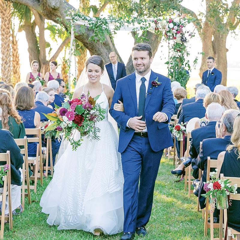
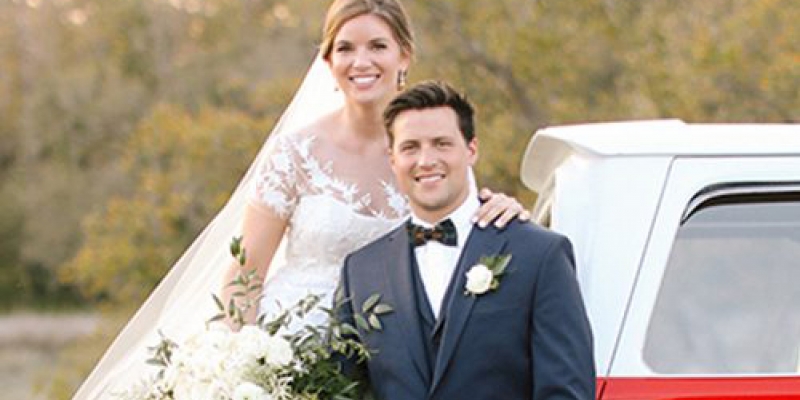
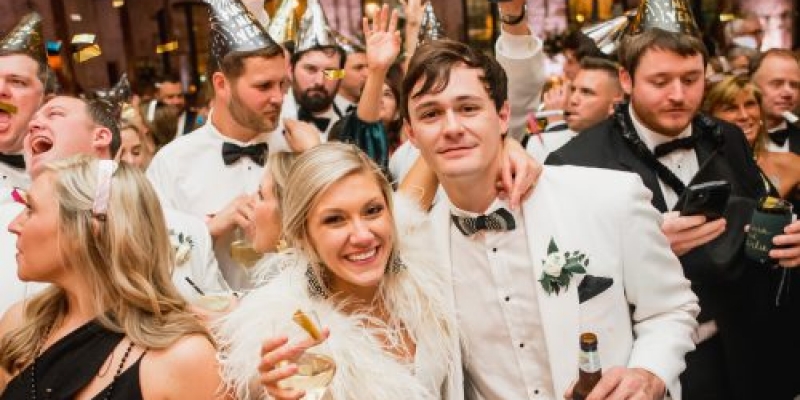
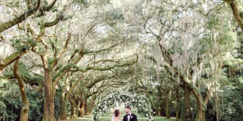
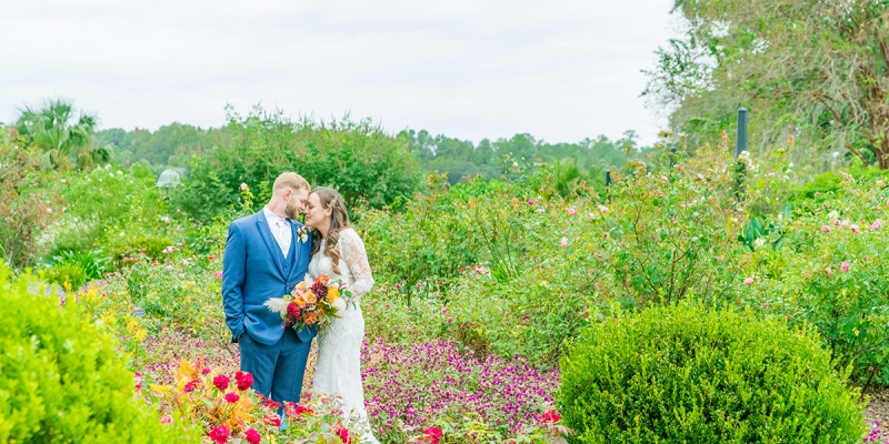
“Find the palette that makes you smile,” says Ashley Wenz of Boutique Planning. Easy peasy, if you’re Caroline Rakar, née Mullis. “I like rich, deep hues and stay far away from pastels,” says the program officer at Coastal Community Foundation who wed fellow Charlestonian Cole at Lowndes Grove Plantation last fall. While her daily wardrobe tends toward blues and blacks, Caroline’s known for working in surprise pops of rich color (on her Big Day her nails were navy), and her wedding was no exception. Gold, bright fuchsia, and emerald green peppered the verdant site to accent the season and setting in rich tones. “I find them to be warm, inviting, and fun,” says Caroline, “all the descriptors I wanted for our wedding.” And while she says the end result was perfection, Ashley bestowed a weighty compliment of her own: “Theirs was my favorite palette of 2017.”
Paint Your Perfect Day
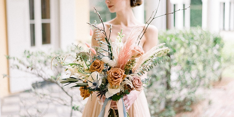
❶ Color outside the lines. SYG Designs gave depth to the florals by using a range of pinks, fuchsias, berries, and purples to complement the main palette.
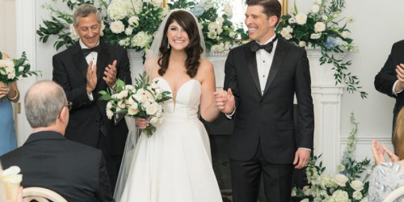
❷ Picture yourself walking down the aisle. “I imagined how fun bold, bright flowers would look playing off of my white dress,” says Caroline.
❸ Play on Pinterest. Caroline’s board included geometric elements and bold hues. Ashley’s interpretation? Geo terrariums housing bright blooms.
❹ Pick and choose. Draping in strong colors has a strong impact. To accent (and not overwhelm) the space, occasional swaths were mixed in with white.
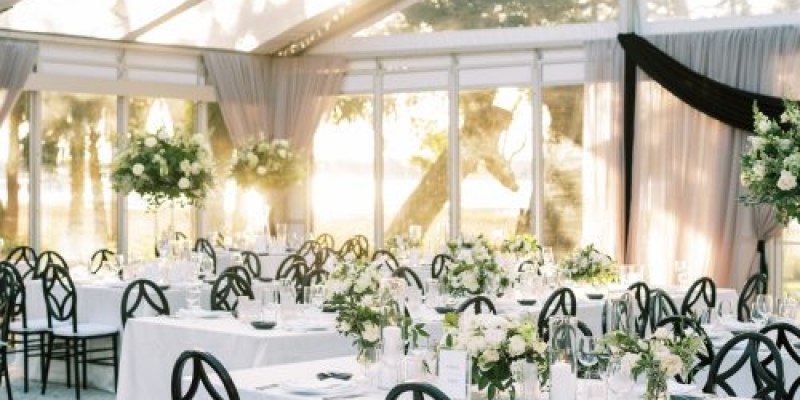
❺ Pop it. In a setting rife with organic blooms, clean-lined furniture in a contrasting shade makes a complementary foil.
❻ Showcase colorful details. Here, classic white cake proved the ideal backdrop for vivid blooms.
❼ Go with statement gowns. BHLDN’s “Fleur” bridesmaid frocks added a living, moving dimension to the colorful scene.
Vendors
Officiant: Rob Sumner (family friend)
Transportation: Friend of the bride’s parents
